



Here’s a test. Take your last nine social media posts and put them side by side next to a competitor’s. Cover the account names. Could a customer tell, in half a second, which posts belong to your business?
That half-second is where branding either works or doesn’t. It isn’t about having a nice logo – it’s about being recognisable at scroll speed, credible at first glance, and memorable enough that when someone in Glasgow finally needs what you do, your name is the one that surfaces. This guide covers what actually makes that happen.
Recognition Is Built by Repetition – and Broken by Inconsistency
Nobody remembers a business from one exposure. Recognition compounds: the same colours, the same style, the same voice, seen dozens of times across the feed, on Google, on the van, on the shopfront. Each consistent appearance deposits a little familiarity. Each inconsistent one – a different font here, an off-brand graphic there – quietly withdraws it.
This is why loud one-off creativity loses to quiet consistency. A modest visual system applied ruthlessly beats a brilliant design applied occasionally.
Five Signs Your Brand Is Costing You Customers
- Your feed looks like five different businesses. Different fonts, clashing colours, mixed graphic styles – recognition never compounds.
- Every post is designed from scratch. No templates means slow production, which means inconsistent posting, which means the algorithm buries you.
- You look smaller than you are. Dated or DIY visuals make customers assume the work matches. Fair or not, they judge the wrapper.
- Your online presence doesn’t match your real one. A great shopfront with a weak feed (or vice versa) creates doubt at exactly the moment people are checking you out.
- You can’t describe your own brand in a sentence. If you can’t, your content can’t either – and neither can your customers when they recommend you.
What a Brand System Actually Includes
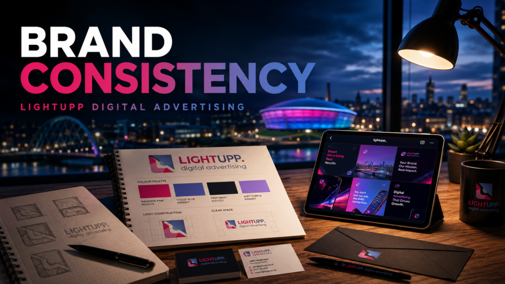
The logo is maybe 20 percent of the value. The rest is the system that keeps everything you publish looking like one business:
- Logo suite: primary, secondary and icon versions, in colour, mono and reversed formats – so it works everywhere from a favicon to a van.
- Colour palette and typography: exact codes and named fonts, so nothing drifts over time.
- Brand voice: how you sound – because inconsistent tone erodes trust as fast as inconsistent visuals.
- Social media kit: profile graphics, post and Story templates, highlight covers. This is where your brand lives daily.
- Applications: Google Business Profile assets, email signature, and the print items you actually use.
The test when comparing proposals: if a “brand package” contains no social media templates, it was designed for a world where your brand lived on letterheads. Yours lives in a feed.
Branding Is a Social Media Performance Input
This is the connection most branding conversations miss: brand consistency shows up in your numbers, not just your aesthetics.
- Recognition speed – consistent visuals make your posts identifiable mid-scroll, before anyone reads a word.
- Perceived credibility – the same offer converts better in polished, coherent creative.
- Better ad delivery – Meta’s auction rewards creative people engage with; branded, professional creative earns it. (Our guide to why ads underperform covers this in depth.)
- Faster production – templates turn every post, GBP update and ad variant into a minutes-long job, which is what makes a consistent publishing cadence sustainable.
This is why we treat branding and social media as one discipline, not two projects. A brand built by the people who will publish with it every week gets designed for the feed, not the boardroom wall.
Refresh or Rebrand? A Quick Decision Guide
| Your situation | What you need |
| Logo feels dated but is recognised locally | Brand refresh – keep the equity, modernise the execution |
| Visuals are inconsistent across platforms | Brand guidelines + social kit – often no new logo needed |
| Business has outgrown its name or positioning | Full rebrand with strategy |
| Launching a new venture | Brand identity from day one – do it properly once |
Frequently Asked Questions
What is brand consistency and why does it matter?
Brand consistency means your business looks and sounds like the same business everywhere it appears – same colours, fonts, templates and tone across your website, social feeds, Google Business Profile and print. It matters because recognition is built through repetition: every inconsistent post resets the process.
What should a brand identity actually include?
More than a logo: a full logo suite (primary, secondary, icon versions), defined colour palette and typography, brand voice guidelines, and – critically – templates for the places your brand lives daily: social posts, Stories, profile graphics and Google Business Profile assets. If social templates are missing from a proposal, ask why.
Do I need a full rebrand or just a refresh?
If your logo is dated but recognised locally, a refresh – modernised execution, updated colours and fonts, new templates – preserves the recognition you’ve already earned. A full rebrand makes sense when your name or positioning no longer matches what you do, or your reputation needs a genuine reset.
How does branding affect social media and ad performance?
Directly. Consistent, professional creative gets recognised faster in the feed, is perceived as more credible, and earns higher engagement – which Meta’s ad auction rewards with better delivery. Templates also speed up content production, so you publish more consistently. Branding is a performance input, not decoration.
Would You Pass the Half-Second Test?
LightUpp builds brands designed to perform on social – because as Glasgow’s social media experts, we’re the ones publishing with them every week. Book a free brand review and we’ll show you exactly where your current brand is costing you attention.


